A brand new (re)branding
These past few months, we wanted to give Ludus a second life. We've pushed ourselves on improving the product and releasing new features, trying to bring our users some new meaningful updates. And still working hard on it.
When so much happens you also need to sit down and think beyond product features: does Ludus need some (re)branding?
Existential time leads to existential questions
There were some pretty big changes at Ludus. As usual when that happens, it's always good to make sure that we all agree on what the brand should be. Let's not get into too many details here but after several meetings and workshops we all agreed that:
Ludus is a playground, the magical and smart platform where talented teams collectively enhance their brand daily and cast it to wow the world.

This is an Unsplash picture, yes. We don't usually take picture of us in a workshop but it's nice to illustrate what it could have been.
The next question was of course: does Ludus need a visual re-branding? You don’t really want to change something that’s not that old nor terrible. That being said, we saw several issues with the previous branding.
Where’s my wordmark?!
Ludus' logo was only a symbol. A pretty nice symbol. But for people who saw this geometric shaped L and didn’t know anything about the company, they were like “Yup, I have no idea what to type in Google to find what that is.”
So, since we’re not as famous as Apple (yet), we thought it might be useful to have the word Ludus added to the logo.
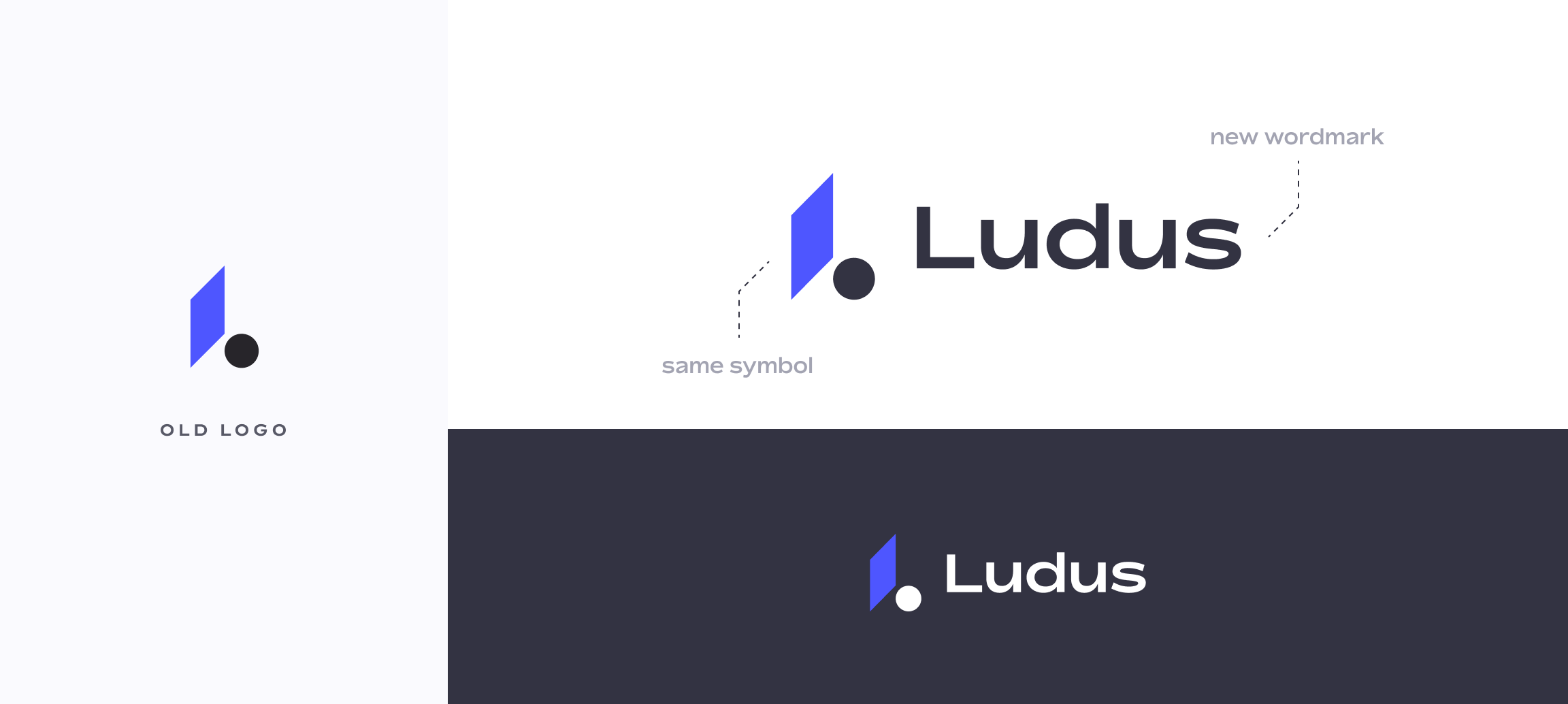
Note: We really did enjoy seeing people creating their own Ludus wordmark to talk about us (not).
Expanding the visual system
Colors
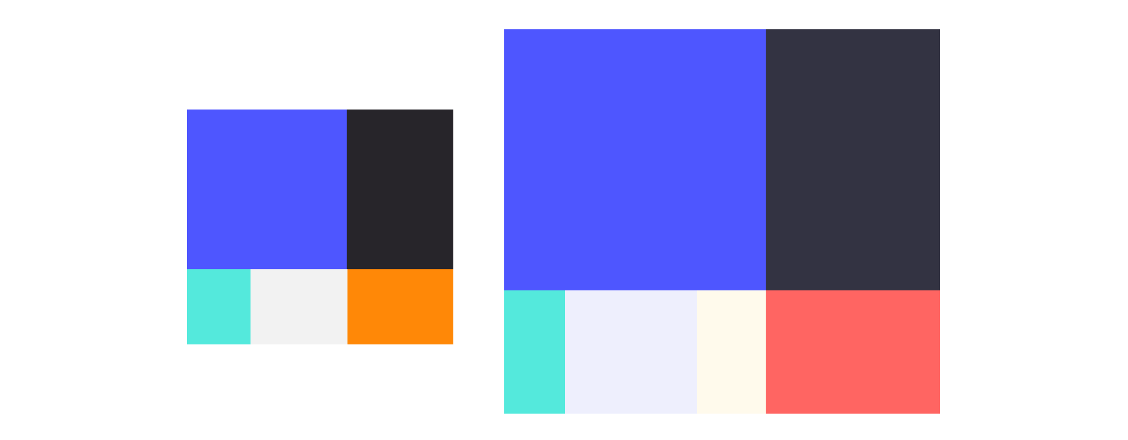
To match this new cycle of life, we thought we might expand the color palette as well. All of Ludus' colors were all very saturated and we wanted to tone some of them down to create a better balance between the playfulness and the confidence.
We kept the original blue and infused some into the black. We kept the contrast with a new secondary coral color to bring positivity and friendliness. We added as well a range of new tertiary and UI colors.
Finally, we used to work with a lot of gradients in our marketing assets. We decided to go back to basics and use plain colors.

Shapes and other things
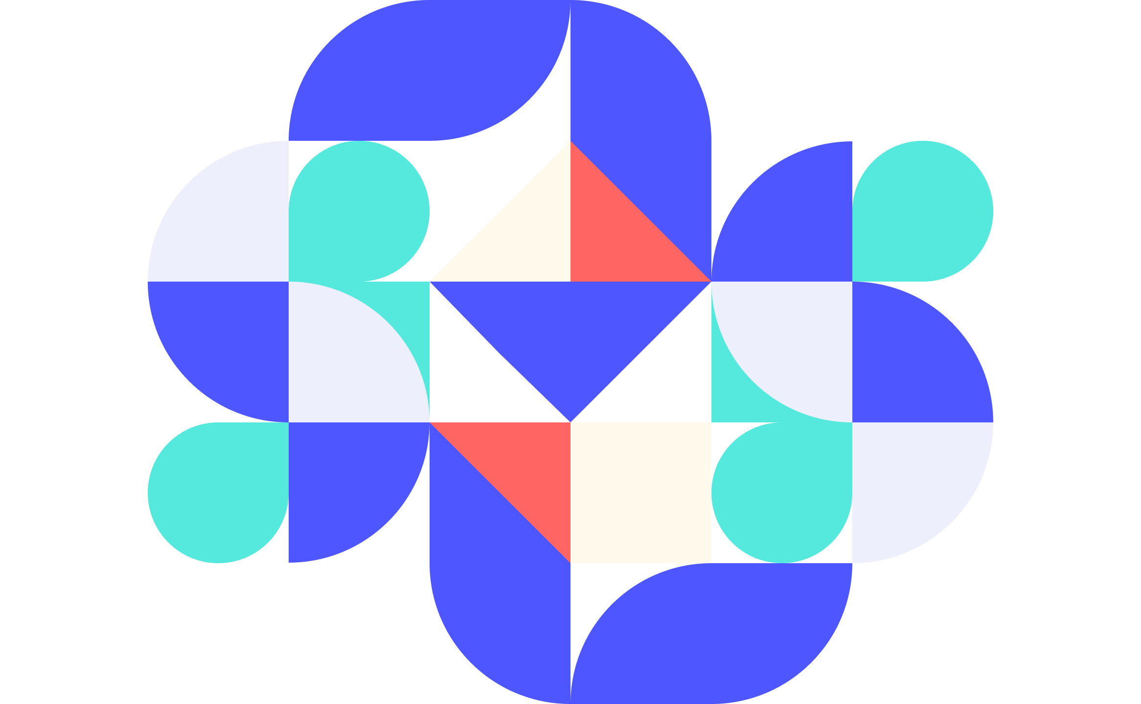
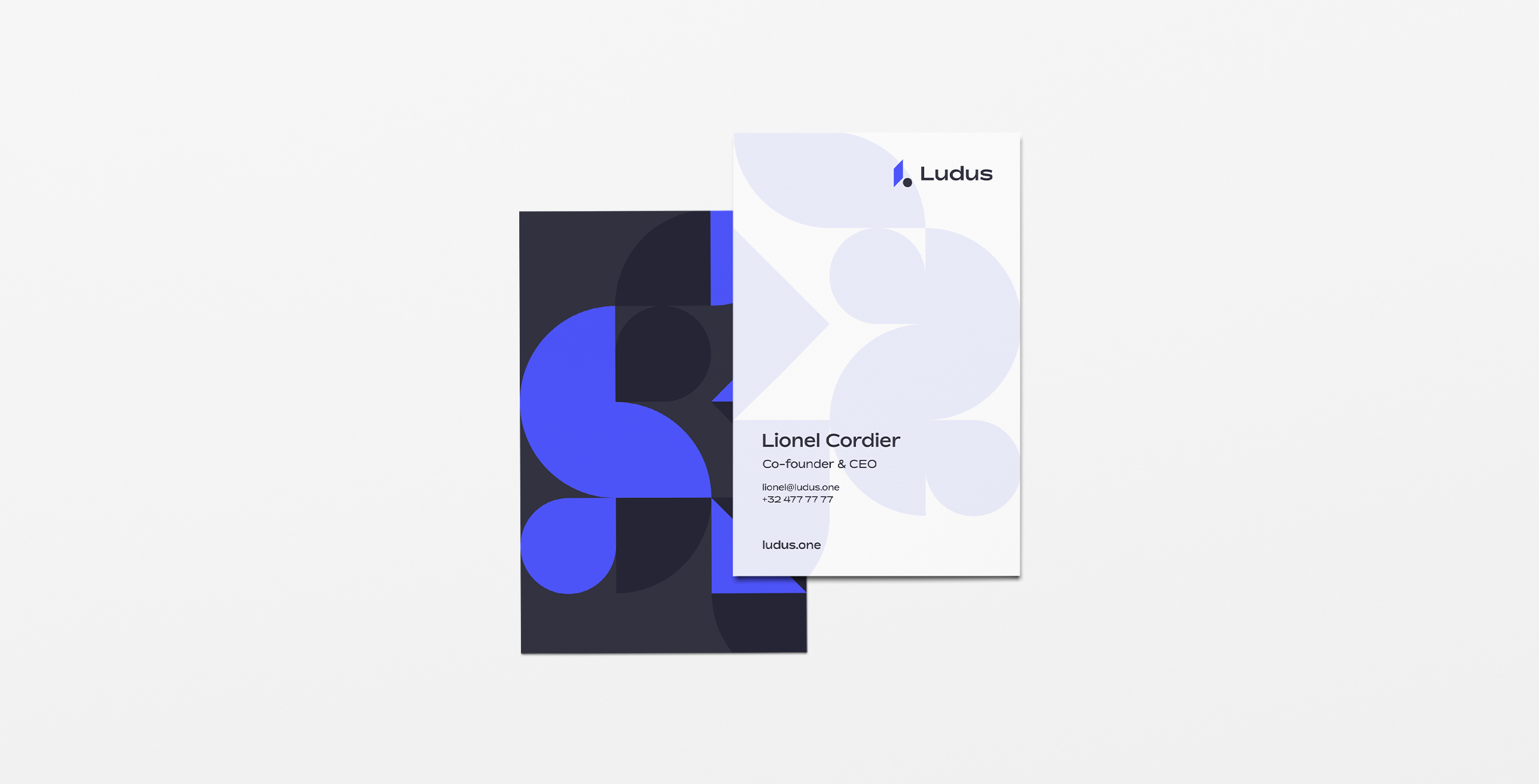
If you’ve been using and following Ludus for a while now, you might remember that we used geometric-based illustrations. We used geometric-shaped animals. Geometric-custom-based typeface. Geometry everywhere.
However, we felt that the whole animal realm was taking too much space and attention (and a looooot of time to create ^^).
But these geometric shapes still represent Ludus' identity: building, creating, being rigorous while being playful. And we did not want to ditch that at all.
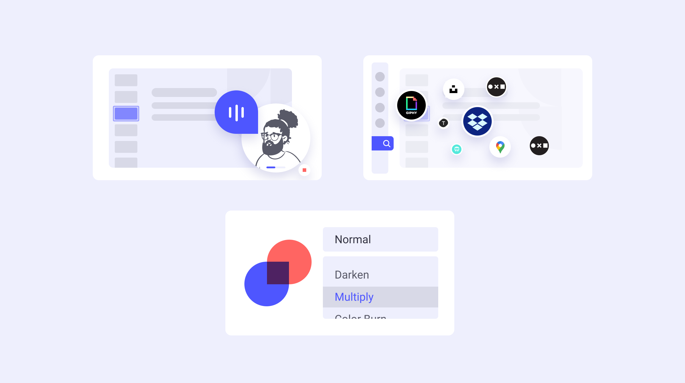
Therefore, we decided to go more abstract and leave more space to the product itself. At the same time, we’re still creative. That’s why we introduced naive illustrations to visualize features from our product.

A beautiful typeface to rule them all
Finally, we also thought of bringing some new blood into the typography. We were looking for a typeface to be bold, confident while playful and energetic. Well, that’s exactly the definition of Bossa. How cool is that?!
The evolution of everything
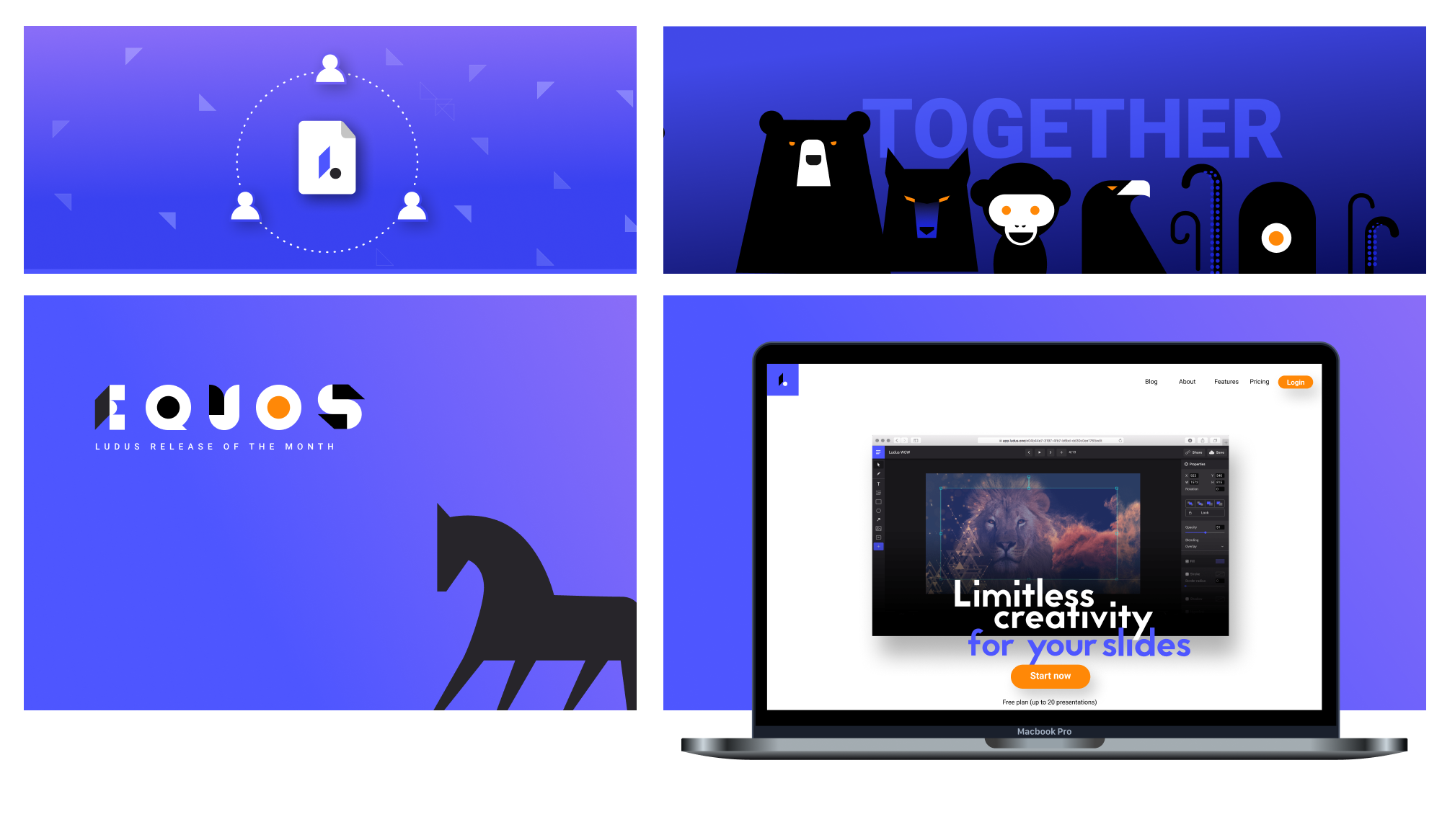
Let's have a look at what was there before...
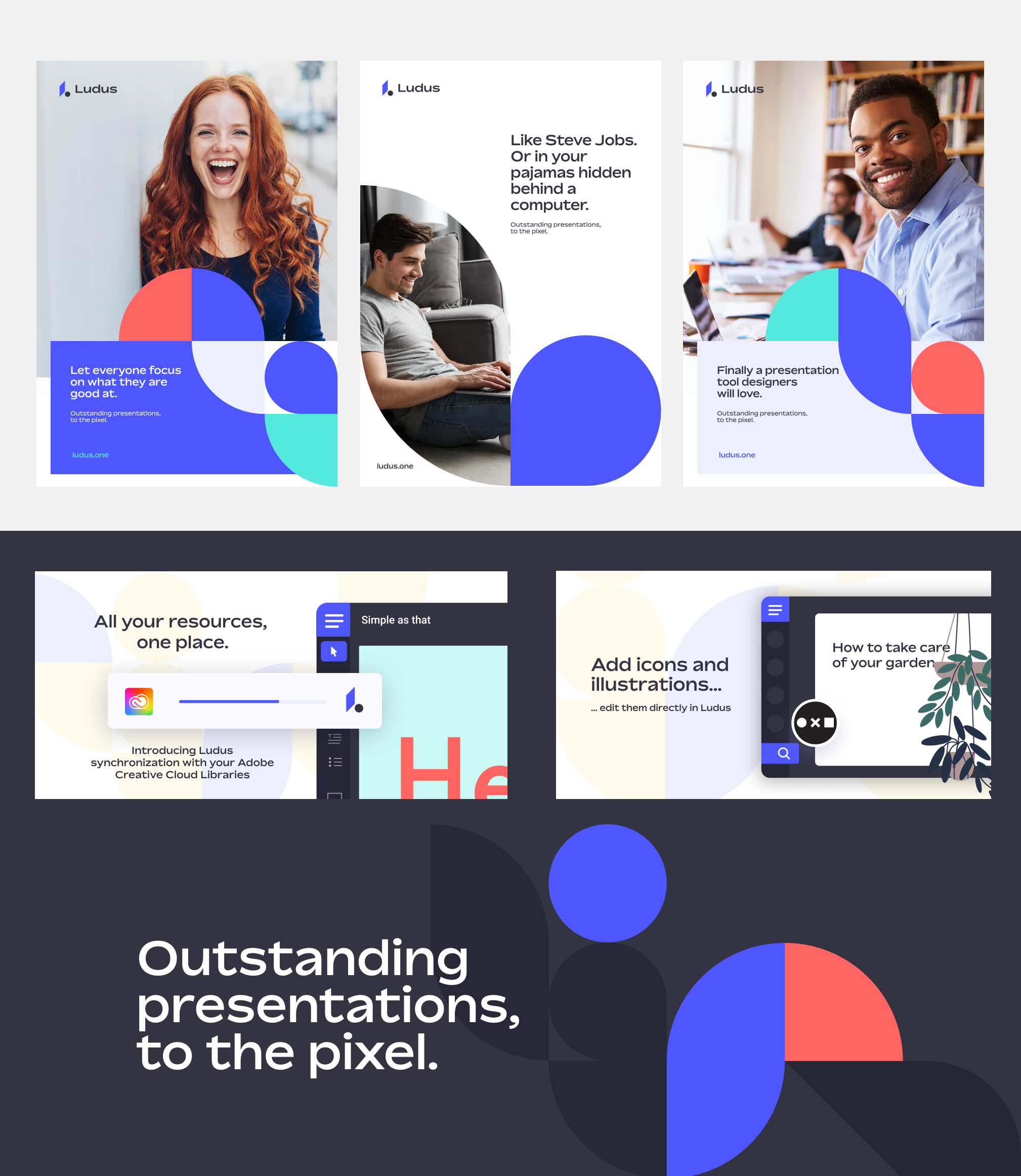
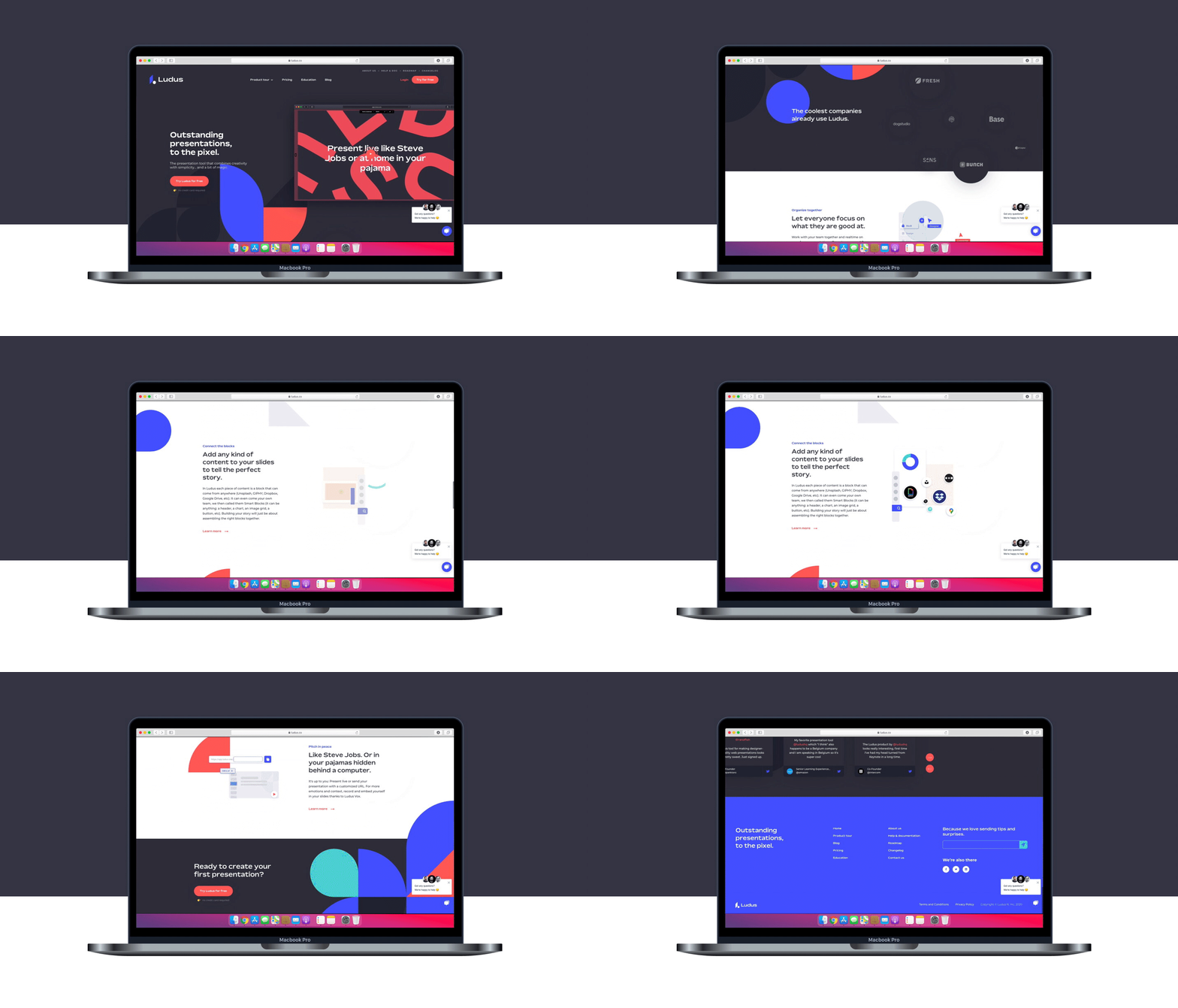
...and what we have now: the brand new Ludus!
To conclude this article, have a look at our new branded user guide right below (yes it's directly embedded in here)