A new viewer, among other things…
We just released the biggest update of the viewer since August 2018. Here’s what it’s all about.

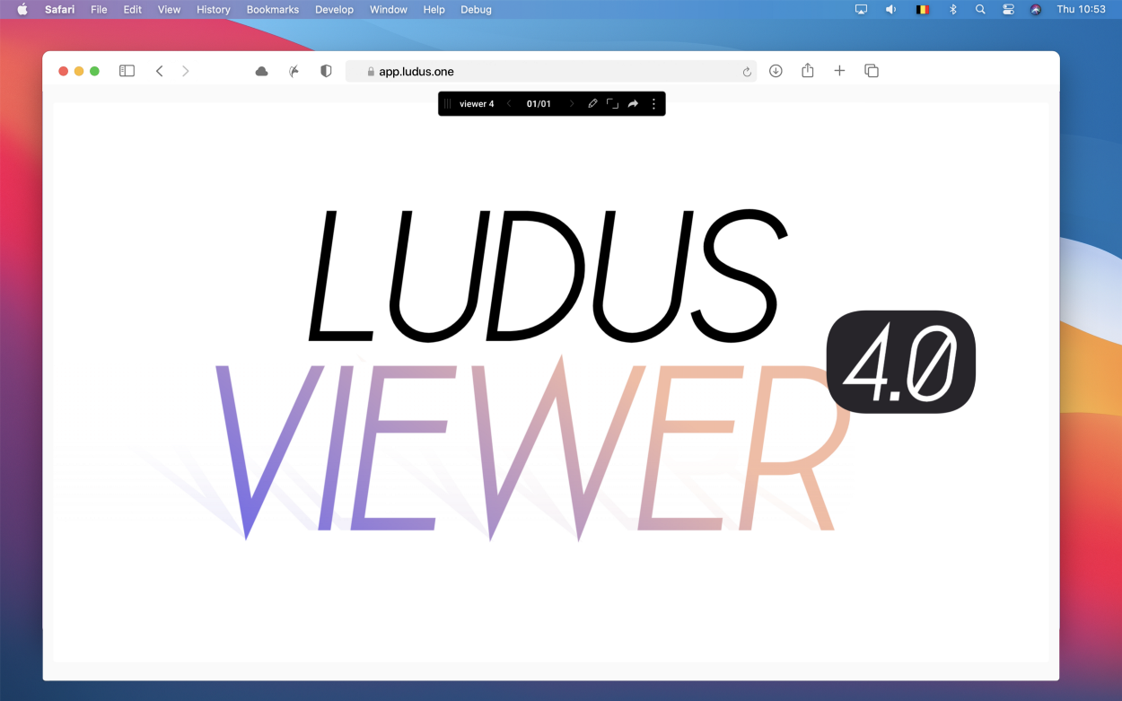
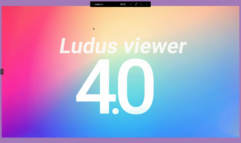
Viewer 4.0
Beautifully minimal
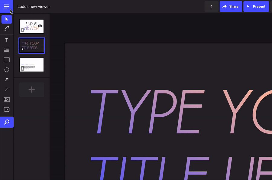
The new viewer is now available for all our users. It has been completely redesigned and simplified. The first key feature is simplicity. And we really mean it, the focus is now completely on the content. No gimmicky features, no more Ludus branding, no more thumbs up or down… just your story.
But there are other things to discover…
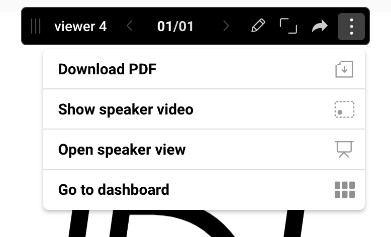
A (powerful) draggable bar
The navigation bar is now draggable, so it will never be obstructing something in your slide. This bar is draggable but it’s also disappearing as soon as you don’t need it. Just move your mouse to get it back on screen.

In this bar, you’ll also see a few key functions such as navigating your slides or going fullscreen, but there’s also a submenu with secondary actions. This is where you’ll get the Ludus Vox feature, open the Speaker View, etc.
Dynamic background color
It’s a very discreet “feature”, still we believe it has a very strong impact. In Ludus, if your window ratio is different than your presentation ratio, you got black bars on the sides (or at the top and bottom) to fit your slide in the window. Now, instead of black bars, you’ll get a dynamic background color based on the content of your slide, to offer a more pleasant visual experience.
Goodbye useless features
We got rid of some “social” features, such as the number of views, comments, thumbs up and down, etc. They had very low usage, and don’t bring significant value for your content. Regarding the comments, they’ll be back at some point, but in the context of collaboration within your team.
New navigation in editor
We finally added real navigation in the editor. So most common actions, such as copy and paste, export, insert, or zoom are now in there.
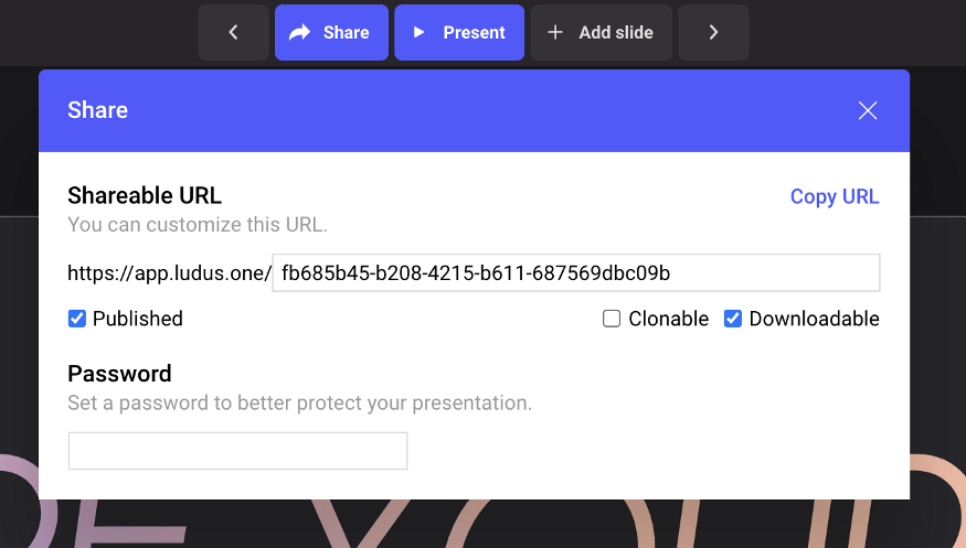
Simplified share panel
In the previous versions of Ludus, the share panel was a big bag full of different unrelated actions, such as share, export, and viewer settings. This has now been drastically simplified. In this panel, you have access to… well… the share settings. That’s it.
As the viewer has been dramatically simplified, many settings can be removed, and all the export actions are now in the top left navigation.
You now have access to the custom URL, the “clonable” and “downloadable” checkboxes (to let your audience do these actions), the “published” checkbox (when you have to unlist a presentation while you do some changes) and the password protection (when you want to make sure only specific people see your masterpiece).
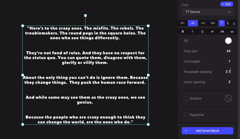
New text blocks
A technical revamp opening the door for much more
They are almost exactly the same and still completely different. They are now powered by Quill, which will help us implement more advanced features such as… bullet lists, yes.
But also, undoing is much more powerful: it will keep in memory your text changes but your style changes as well.
One of the first new features we are now able to offer is paragraph spacing. As the name implies, you can add space after each paragraph of a block. In many cases, it helps the readability and gives more structure to your text.
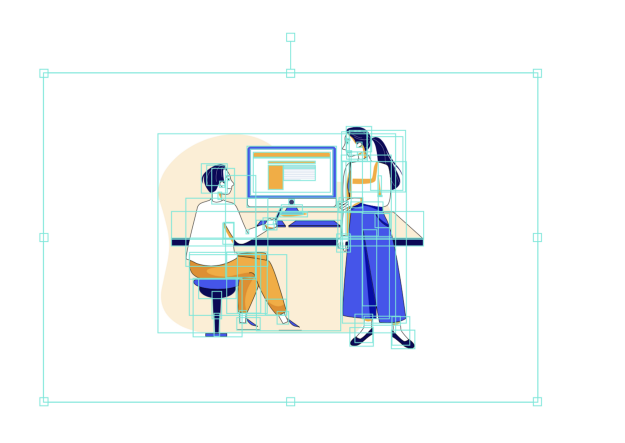
Illustrations from Iconscout
We added a new category in Iconscout: illustrations (and soon photos). We believe it will help you sometimes to fill some gaps. Some of these illustrations are really nicely done.
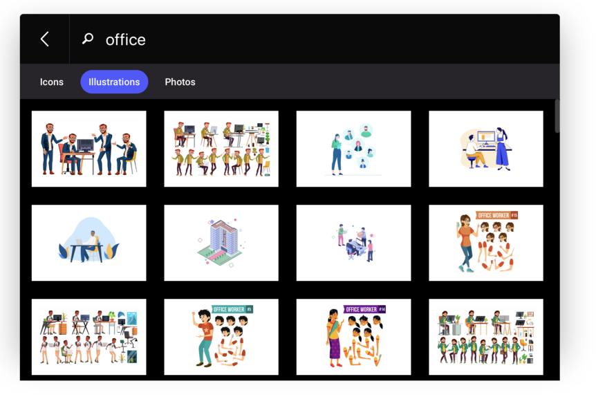
And as we’re talking about vectorial illustrations, you can ungroup them to change the color of specific elements. Or start combining different illustrations together, but be careful, with great power comes great responsibilities…
That’s it for today. We hope you enjoy all these new additions and improvements. You can expect more very soon.