Hey! It’s been a long time, buddy!
What have we been up to these last months? What’s the future of Ludus? It’s time for an update.

Let’s speak frankly, we know that during the past few months we have been much more silent than we used to be. Nothing terrible happened to us, it’s just that we have been working hard and we have been learning from our mistakes. Almost two years ago we released the live collaboration feature to let people work together on the same presentation, with a simple technical approach in mind. It’s working well enough but it has two critical limitations:
- You can’t work together on the same slide, which was okayish at the time for small teams, but it turned out to be a real pain for bigger teams.

- You can’t undo if someone else is in the presentation, which is a deal-breaker for all of us. We thought we’d find a way to fix that without getting into a technical trap, but we mostly failed.
These limitations also caused awkward bugs we had to fix along the way. At some point, we spent more time fixing those bugs than working on a long term solution.
As we are getting more and more teams in Ludus we know we have no choice but to fix it. With a very solid approach. For several months, we’ve been working hard on a technical refactoring of everything touching live collaboration (which is basically everything in the Ludus editor). We decided to stop spending energy on getting more teams onboarded as long as that issue is not fixed. It would have been like filling a holey bucket. That’s why you heard less from us.
This new technical approach will also bring new features on the table (user and group permissions, versioning, smarter Smart Blocks, etc.) It’s coming, as fast as possible, but also (and mainly) as good as we can.
As we are talking about the future of Ludus, we can tell you about two features coming soon… 👀
Google Drive integration
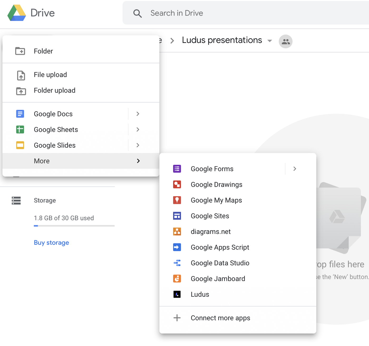
Many of our users are loving the G Suite (we must admit we do as well), but we want you to create presentations with Ludus, and not anymore with that outdated tool called Google Slides. Soon, you’ll be able to create a Ludus presentation right from Google Drive, and the other way around, synchronize your presentations with Drive directly from within Ludus. The Ludus presentations will also be listed directly inside your Drive (but only the ones you choose to synchronize of course).
A new viewer
The viewer is a crucial part of a presentation tool. We changed it many times: we added social features such as comments, likes, views, etc. Some users were unhappy with these social features, so we added a way to hide them, then we also proposed a minimal mode to get back to an experience similar to the very first Ludus viewer. But at the same time, new great features were added such as Speaker View and Ludus Vox. It started to feel crowded and quite complex, with too many settings.
We now want to propose a viewer that truly sticks to our vision. A beautiful and extremely simple one, yet with all the necessary features.
We are so excited about it we want to show it already now that we are polishing it.
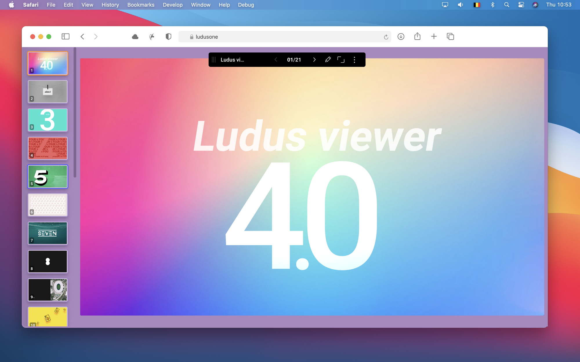
The top bar is now much smaller, you can drag it wherever you want, and it fades out automatically to truly focus on your content. It offers as many features as before but occupies much less space.
We also changed the way to show your slides. You used to have to roll over each small part of the bottom bar to get a preview of the slide. Now, you get a very similar UI as in the editor with all the slides displayed in a scrollable area. Simple but super convenient.
And one last very cool thing: it now has a dynamic background color. In Ludus, we try to offer a pixel-perfect experience so our viewer is never altering its content. It means that if your window ratio is different than your presentation ratio, you’ll get black bars on the sides (or at the top and bottom) to make your slide fully visible inside your window. Now, instead of black bars, you’ll get a dynamic background color based on the content of your slide, to offer a seamless visual experience.

But what about the social features? Likes? Comments? Gone. Because it was barely used. We are more than happy to let your audience focus on what truly matters: your content, your story.
Oh, and yeah, we did release a bunch of new features in the past few months!
Let’s wrap up this already too long blog post, with the small and not so small updates since our last post:
- Many bug fixes — We won’t detail all of them, but we were mostly focused on user authentication, history (undo/redo), CPU and memory usage, payment process (clearer error messages mainly), and visual coherence between the viewer and the editor.
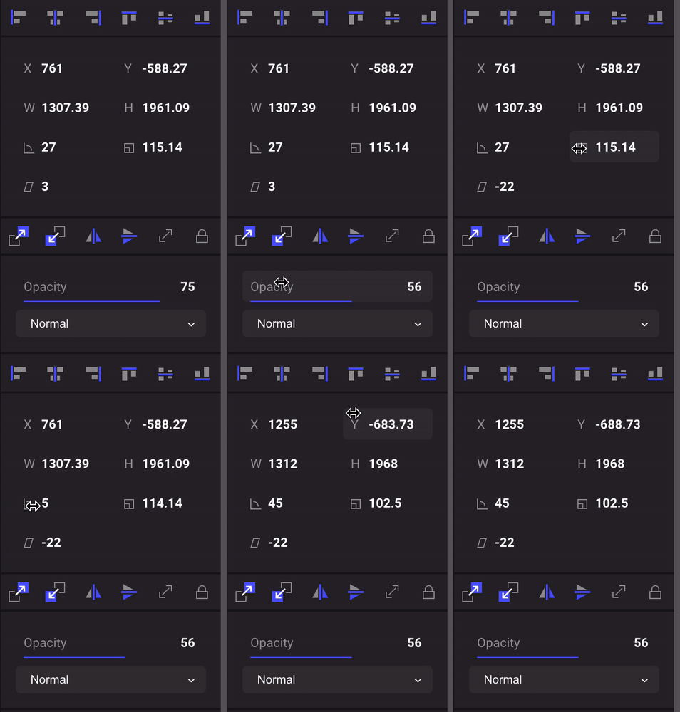
- Scrollable props — It lets you change any property with your mouse only. It can be super handy for some props, like drop shadow. Pro tip: on some props, you can reset to 0 with a simple click (on angle or filters for example)
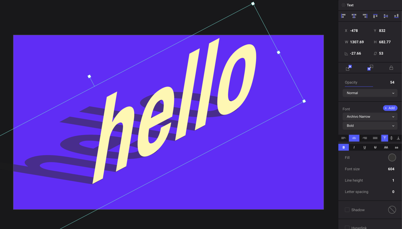
- Skew — You can now skew anything in Ludus. It may sound a bit silly but you can create very cool isometric visuals with this feature. And you can skew not only images or texts but also GIFs or videos!
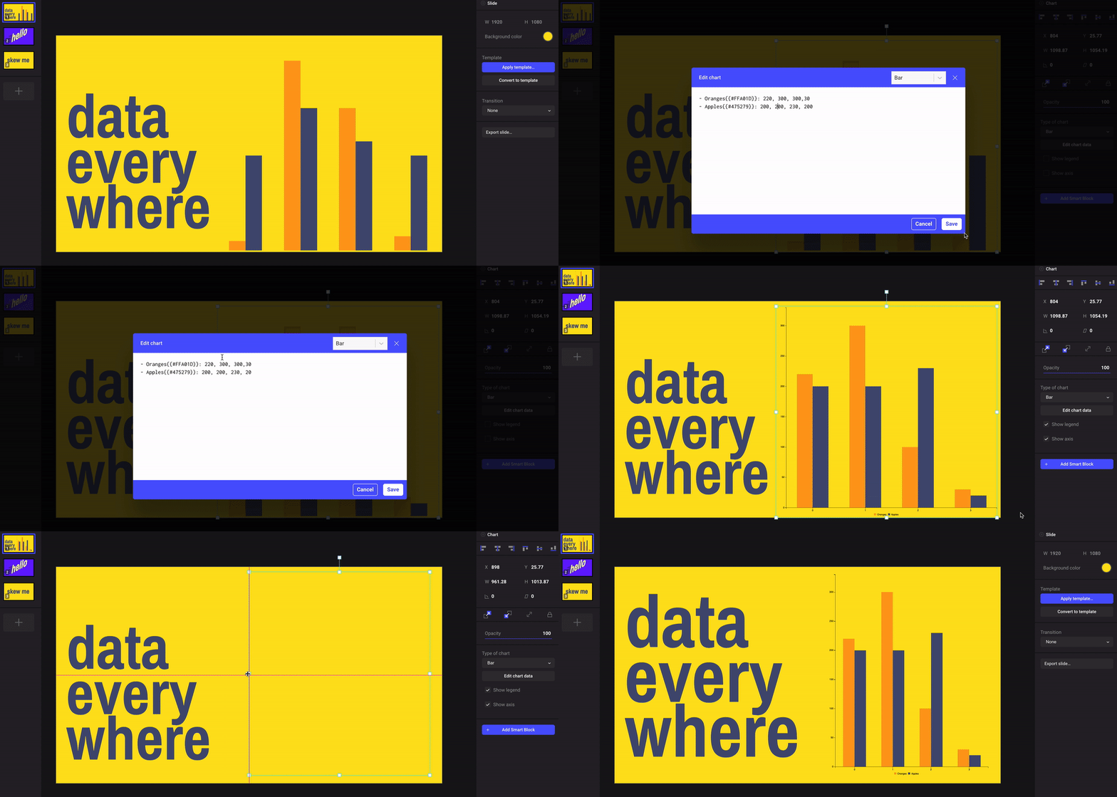
- Charts — Finally, yes, we integrated billboard.js to let you quickly build charts based on the Markdown and CSV formats! It can look a bit technical but it’s actually super straightforward as you can simply copy and paste your data directly from Excel or Google Spreadsheets. We’ve written a help center article on this to showcase the possibilities a bit more. Of course, it’s just a first step, but it’s already being used in many presentations, so we’ll probably add settings and new types of charts in the coming months.
- A simplified slide manager — Many users were a bit confused by our horizontal slide manager, so we made it vertical and put it on the more conventional left side. It’s taking less space and helped us improved performance so we believe it’s a nice improvement.
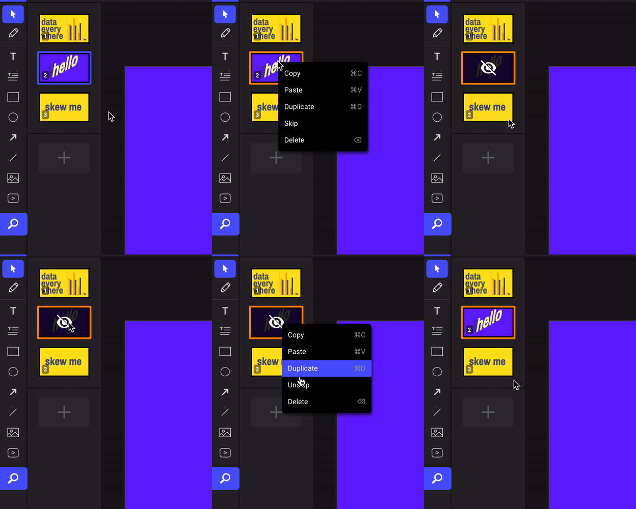
- Skip that slide — You can now hide a slide via the contextual menu in the slide manager. That slide will then not be visible in the viewer.
- PPTX export — Not much more to say than the title, except it’s still in an early beta phase. We want to monitor the usage frequency of this feature and spend more time on it only if necessary (because it’s not easy, and sometimes not possible, to support all the Ludus features in PowerPoint).
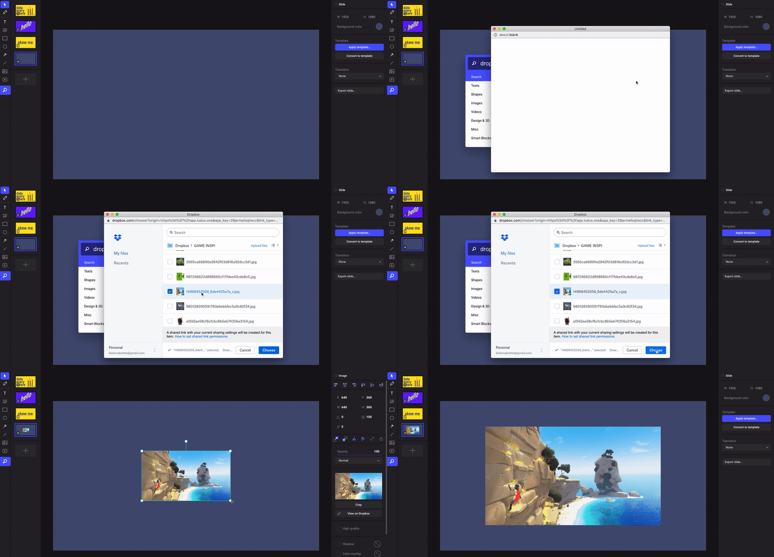
- A Dropbox picker — We added a Dropbox picker, so it’s now easy to browse your Dropbox files directly from Ludus, to add them to your presentations.
- Login with Google — As a first step for the Google Drive integration, we released the login with Google feature. Related improvement: you can now set a password from the settings page if you decide you want to stop logging in with Google (or Facebook) in favor of using the old traditional way (username + password).

- Better guidelines when scaling — You may think we are wasting our time on details, but it was actually a recurring request from many advanced users: our guidelines when scaling an object were a bit weird.
It is now using a more stable and coherent algorithm and it won’t make the object jump awkwardly as it did before. Sorry about that 😅
Thanks for your support! 🚀
To conclude this article, we want to thank you all for your patience and support. Even if we are a bit quiet on the marketing side, we are getting a super solid user growth and this is just amazing. Every day we see more and more users and teams onboarding on their own, building beautiful and insanely great presentations. The quality of what we are allowed to see has never been higher, and we couldn’t be more proud and humbled. So thank you all, and you can expect much more regular news from us from now on!