Ludus has just been redesigned
It was time to improve the UI of Ludus. With time, we filled the editor with new options and we reached a point where it became difficult to read.


So here is how it looks now. You don’t really see what’s new? Please read on :)
By listening to and analyzing how people use Ludus, we listed 4 points to improve:
- Screen real estate
- Readability
- Logic
- Contextual menu (!!)
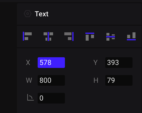
1. Screen real estate
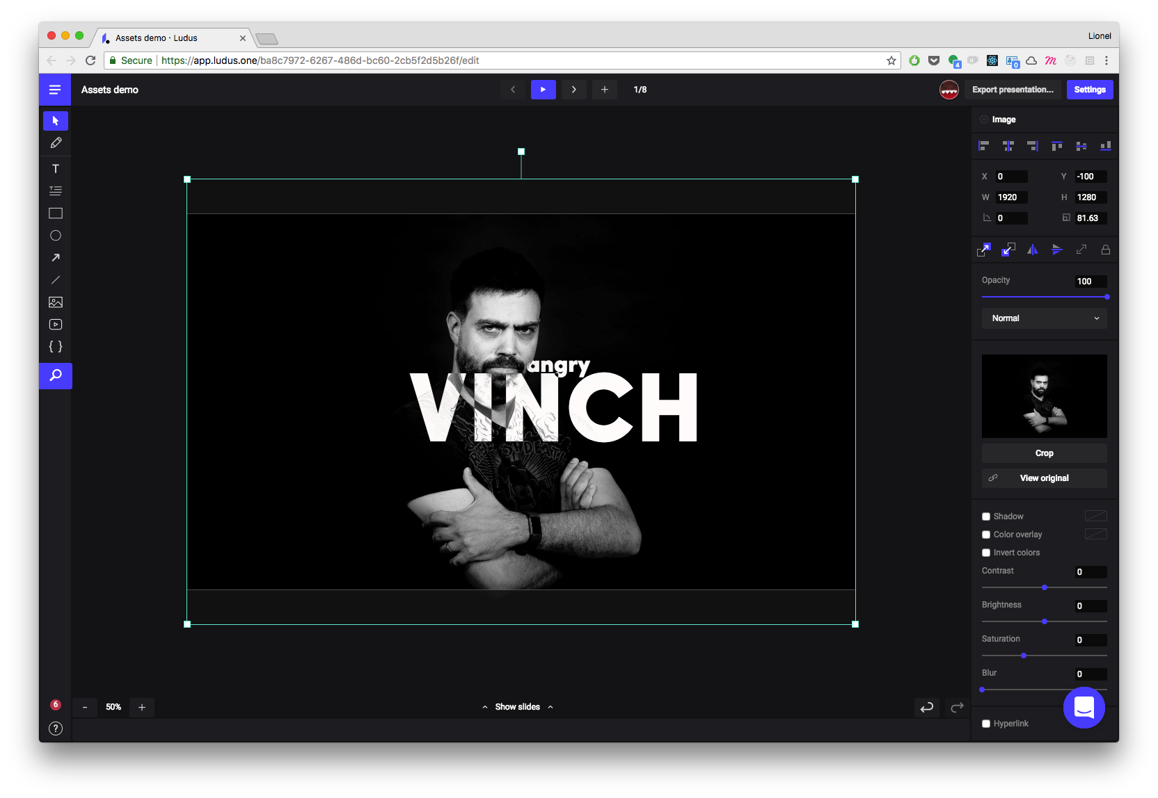
The properties panel on the right was taking way too much space. So we reorganized it. It’s now taking less space, especially on complex objects such as images.
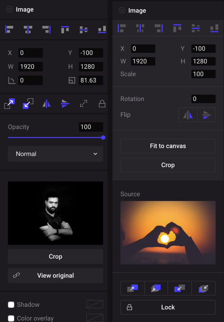
We mainly achieved this by compacting all common actions in a single action bar. You now have depth, flip, enlarge or lock in this bar. It’s good for space but it’s also good for usage, as all these actions are always at the same place, no matter which object you’ve selected.
We also took the decision to remove a feature, or more precisely to hide it a little bit. You don’t have buttons to send to back or bring to front anymore. You only have send backward and bring forward. As we consider this as an advanced feature that only pros are using, you can still activate it by shortcut (Cmd+Shift+↑ or ↓) or by Alt+clicking on the icon (did you know that’s the role of that specific key by the way? https://en.wikipedia.org/wiki/Alt_key). If we see that most users accept that behavior, we’ll push forward that logic on other buttons (click = basic action. Alt+click = advanced action).
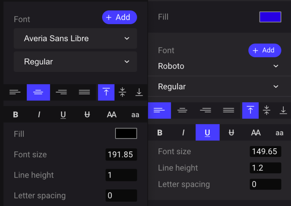
2. Readability
This topic is especially true for non-retina screens. Before, some texts or icons were not super sharp. It has been improved dramatically.
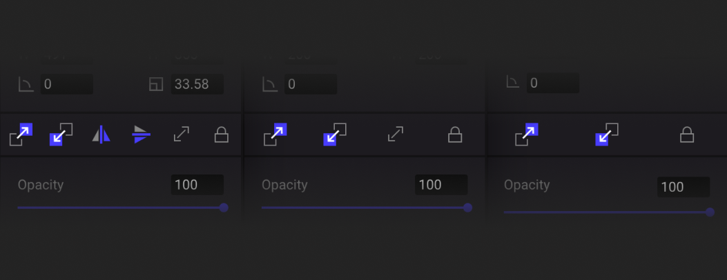
Where it was possible, we made things bigger. For example, the controls corners of objects are now bigger and easier to grab.
We also improved the readability by improving the “hover” states of buttons or dropdowns. For example, you can now clearly see when a dropdown is open.
We used that logic on the left panel as well. We think this is that kind of details that helps understand what’s happening in the app. Another example is the way we highlight the currently selected text field in the property panel. Now, you can clearly know where the focus is.
3. Logic
Fot this, it’s just about how things are grouped. Text properties listing is one typical improvement. Before, color was a bit “outside” the text settings and people had a hard time finding it. Now it’s embedded in all the text settings as you would except it to be.
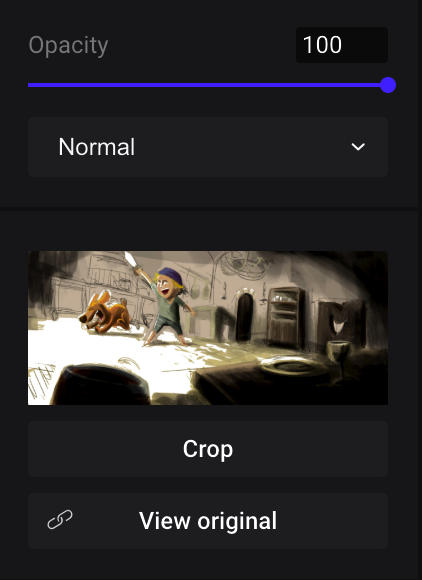
And by the way, there is now a common button to see the original file or source on all blocks you uploaded or embedded. It means you can see the original uploaded image or video (and redownload it if you need to).
4. Contextual menu
We already had a contextual menu at very specific places (in the slide manager or in the Smart Blocks section in the Smart Menu). Now you can basically use it everywhere. We know that it will help many new users to quickly find their way in Ludus.

As you would expect, it lets you do all the basic stuff related to the currently selected object.
There is one small but really cool change that appeared thanks to the contextual menu: it helps you manage locked objects in a more precise way. Now, when an object is locked, you can still select it by right-clicking it, and then unlock it from the contextual menu. Pretty cool right?

There are many other little things that have been improved, such as a bigger window for Unsplash or GIPHY search results, and bigger buttons here and there.
Also: you don’t have to hold Shift to deform a shape anymore. Now it’s the default behavior. Using Shift will constraint the ratio (as in most other softwares).
This new UI is also a way for us to prepare for the next big updates coming soon. Hope you’re all ready!