We changed our minds. Bulleted lists are here.
For a very long time, even though it was one of our most requested features, we resisted adding it because it was in opposition to what we believed was a good presentation.

We finally did it. Bulleted (and numbered) lists are here.
It took a long time, not because it was technically difficult to build, but because we never really believed in them. We’ve seen enough bad presentations in our lives to make these same things happen all over again in our own tool.
For us, and for many other experts in the sector, bullets are bad for presentations. Whenever someone asked us to implement the feature, we referred to this article explaining why it’s better to avoid them. In it, the author explains that bullet points make information more difficult to remember, adding that this is not a conjecture; it is backed by credible research. In short, quoting the work of Chris Atherton, an award-winning lecturer in psychology, the article says that you should always try to reduce the text in your slides, in favor of relevant visuals; and you should ideally convey only one idea per slide.

What changed?
We were really tired of people protesting in front of our houses. For a while, it was bearable, but when you have a family, having people throw rocks and rotten eggs directly through your windows can be very stressful.

Joking apart, we simply put our pride aside and started listening to the arguments of your customers. We realized that this thing has become bigger than ourselves. We can’t decide for everyone. It’s not our baby anymore, it’s your baby.
Steve Jobs once said that letting iTunes and the iPod run on PC would happen “over my dead body.” He finally changed his mind and making iTunes available on Windows was a key moment that made the iPod become extremely popular, and paved the way for everything that followed afterward.
We don’t want to compare to Steve Jobs or Apple, we know we’re still galaxies away from their successes, but if someone like him can swallow his pride and change his mind, we can too.
Speaking of Steve Jobs, we can definitely all agree that he was one of the best keynote speakers in history. His presentations were always a greatly anticipated spectacle. To this day, it seems no one has managed to match him in this particular exercise. And you know what? He did use bulleted lists. Well, not bulleted, but lists. If anything, it shows that lists can be very useful in certain cases. It’s the abuse of them that is bad. If the best presenter of all time did it, it must be good, right?

How does it work in Ludus?
Well, it works pretty much as you would expect, with a few cool twists.
If you quickly want to create a bulleted list, you can use the shortcut for it in the left column. After that, you can easily turn it into a numbered list with the dropdown located in the right column.
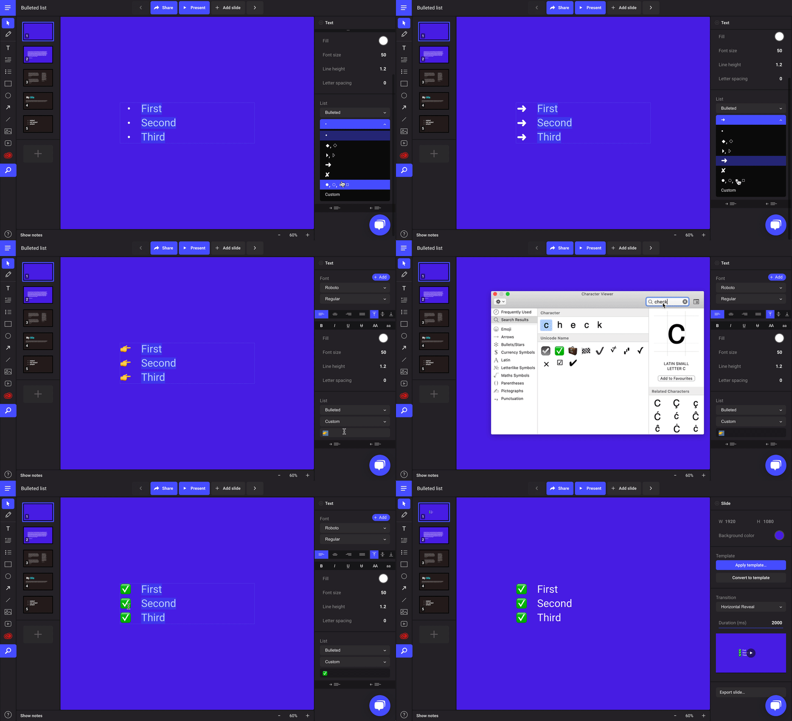
The nice thing with bulleted lists in Ludus is that you have a vast choice of bullet styles, and the best of all: the possibility to choose your own custom bullets. You can even use emoji! Each emoji applies to an indent level (and if you don’t provide enough emoji per indent level, we’ll loop back to the first emoji provided).
Indent level works the same as in many other apps, just use the Tab key to increase the level (or Shift+Tab to decrease).
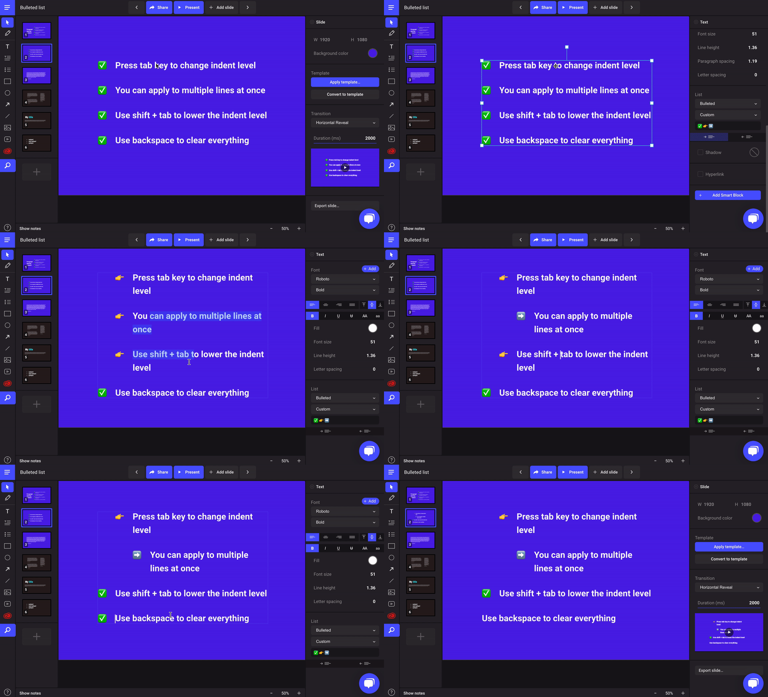
Note that bulleted and numbered lists are not a new type of block but simply a new type of styling inside a good old text block. The same way you can apply bold or italic to some parts of your text, you can now also have an inline list inside your text block.
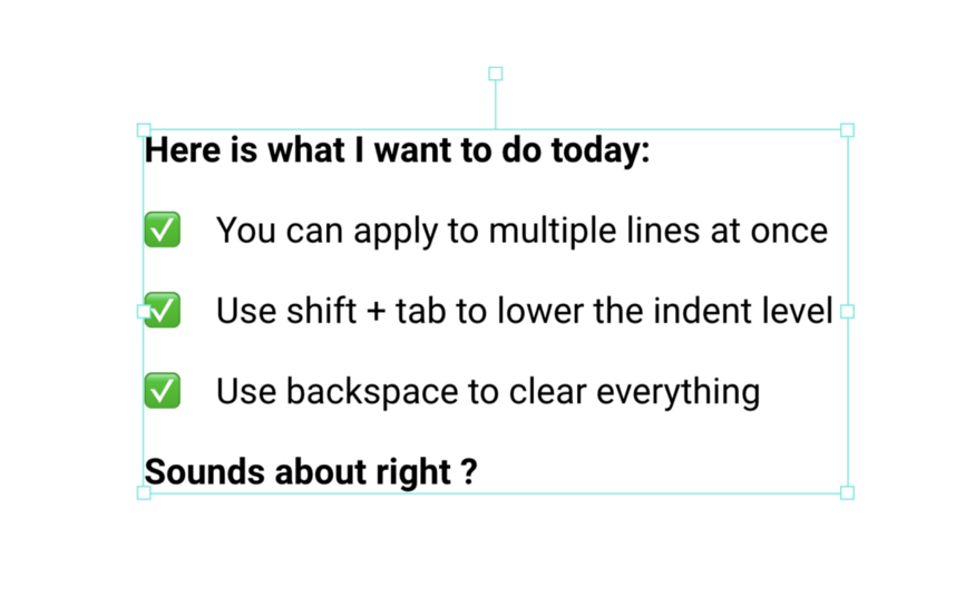
Inline lists are possible of course! (You can even mix bullets and numbers… but don’t do it please.)
Don’t forget that you can use the recent “Paragraph spacing” option to manage the space between your list items, the same as you would do with paragraphs.

That’s it for now. We’re very happy to finally be able to release this one. And we hope the people who are camping in front of our houses will finally leave now. It’s been too long.