Common bad presentation mistakes to avoid
We’ll show you how to turn your bad presentation into a fantastic one by avoiding these ten mistakes that everyone makes.

Leave bad presentations behind by avoiding these 10 mistakes
Look, we get it. Presentations are stressful and anxiety-provoking. If it’s any consolation, glossophobia, or the fear of public speaking, affects up to 75% of the population, so you’re definitely not alone. On the flip side, excellent presentation skills are a critical part of professional success.
Let’s examine the most common presentation mistakes—and how to avoid them—so that your presentations are compelling and your audience hangs on your every word.
Mistake #1: Failing to rehearse
Even if you’re an expert on your presentation topic, you should spend some time practicing. Ideally, you’ll practice in front of a few trusted colleagues, but recording yourself on your phone or even practicing in front of a mirror will help you see what your audience sees. A few people will counter this by saying too much rehearsal will lead to appearing unnatural, but that’s a myth. In fact, according to one source, there’s a ratio you should follow: Be sure to practice for an hour for every minute of performance.
Make sure you practice with the slides you’re going to use in your presentation so you know you have enough. Practicing will help you get rid of your “uhs” and “ums” when you talk, and will also help you stop fidgeting.
Mistake #2: Reading the slides to your audience
There’s nothing worse than when a speaker simply reads slides to the audience. Slides are a tool—a visual aid you can use to keep yourself organized. If you’re reading the slides:
- You have too much content on the slides.
- You’re looking at the slide instead of engaging with your audience.
- Your audience is wondering what purpose you serve since they could have just read your presentation off of a memo.
Use the slides to keep you on track and to provide visual reinforcement to your points. They shouldn’t be major points in themselves.
Mistake #3: Creating boring slides

Your slides are there for your audience, not for you. You can use them to help keep yourself on track, but they’re meant to create visual interest. Too much content, too many bullet points, or slides that all look the same are surefire ways to lose your audience's interest. Another way to create a boring slide is to use either a dark background or a really bright background that makes everything difficult to read (and, therefore, totally unengaging).
You want colorful, bold slides with just one or two points on each slide. Use complementary colors and make the background white or a very light color. Make sure to use high-quality graphics and choose a clean, easy-to-read font. Keep it clean and interesting. Use rulers, cropping, and graphics to help create visual interest.
Mistake #4: Stating fact after fact
The average person has an attention span of eight seconds. One of the easiest ways to lose that attention is to state facts without showing how they’re relevant. Think about the goals your audience has (and the goals you have for them) and how you can help them meet those goals. Rattling off fact after fact is boring if there’s no context.
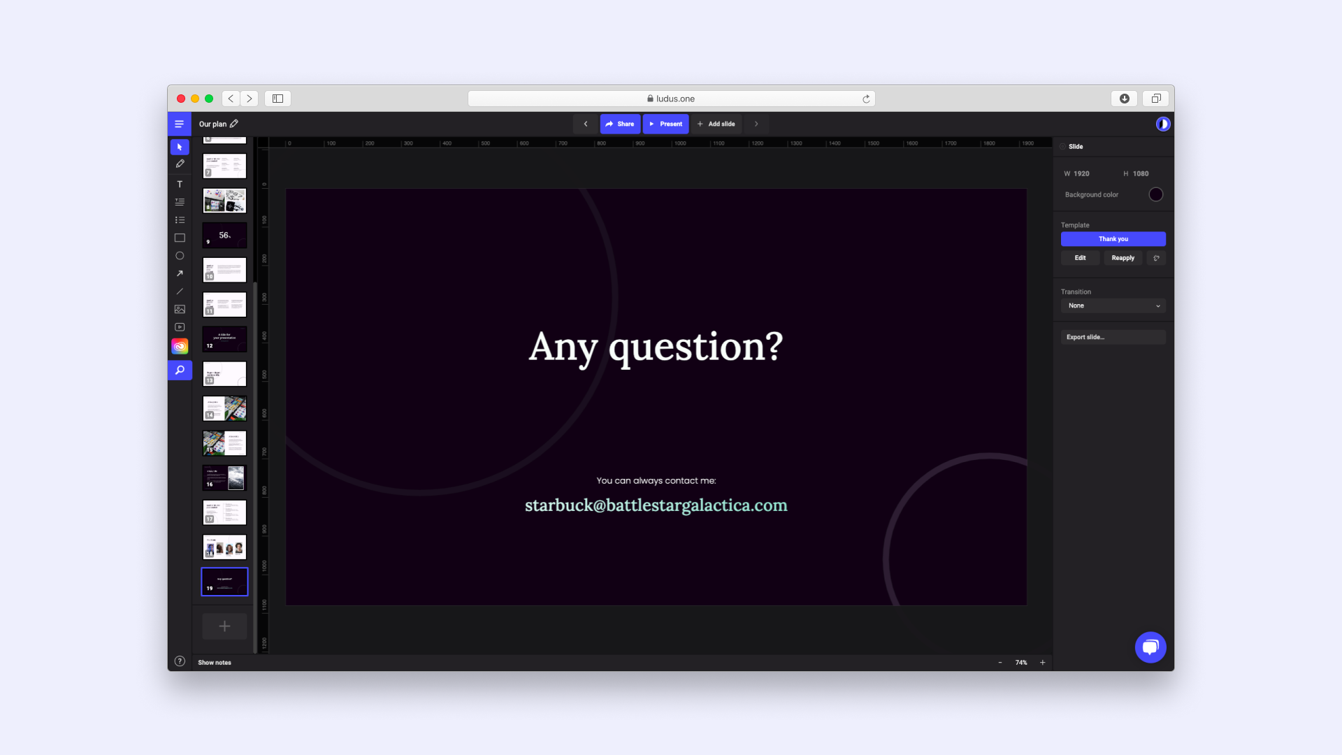
Make sure to use templates with a tool like Ludus to organize your thoughts into a cohesive theme that will hold your audience’s attention and keep everyone on the same page.
Mistake #5: Giving too many details
No matter how long you have, you don’t have time to include absolutely everything you know. Sticking with one or two main ideas is one of the ten effective techniques necessary to create a successful presentation. Facts and figures can be, well, boring—and if there are too many of them, your audience will tune you out. Use facts to back up your position, not to be the focal point of the presentation.
Mistake #6: Pretending your audience isn’t there

It takes a lot of practice to get to the point where you appear natural in front of an audience. People who aren’t comfortable presenting tend to:
- Look down when speaking.
- Talk really fast.
- Talk too slowly.
- Speak monotonously.
It’s natural to be nervous, but you should talk to your audience—not at them, and definitely not at the floor. Acknowledge that you’re nervous and your audience will immediately identify with you and start to root for you. Most of them have probably been in your shoes and know what you’re going through.
Just remember that you also have to keep them engaged by being excited about what you’re saying. How can you expect your audience to be enthusiastic if you’re not?
Mistake #7: Not doing any research on your audience
Why are they there? What are their goals? What do they need? You can tailor your presentation to industry insiders, laypeople, and anyone in between. But if you adapt your presentation for the wrong crowd, you risk losing the entire audience.
Mistake #8: Using jargon

A lot of presenters make the mistake of assuming their audience knows as much as they do, so they don’t explain terms properly. If your audience hasn’t memorized what CPC (cost-per-click) means, they’re going to spend time searching for that information in the archives of their brain. That’s valuable time they’re not listening to you, and you might not get them back.
Mistake #9: Not having a back-up plan
Something will probably go wrong: Either you’ll lose your internet connection, there will be a fire drill, or someone will walk in 20 minutes late. Relax. Don’t let it get you flustered. Just adapt as well as you can. Practice without slides once or twice, and practice for interruptions. Your audience knows you can’t control everything.
Mistake #10: Forgetting your CTA
Even if your CTA (call to action) is to have your audience mark their calendars for some future date, don’t forget it. Otherwise, what was the point of making a presentation?

Ludus can help you ditch bad presentations for good
Bad presentations should be avoided at all costs. Let Ludus help you create presentations that shine.
Try it out for free.